12 Days of Data Analytics: Day 8 – Pay Attention!
One of our favourite Christmas traditions is geeking out on the Royal Institution Christmas lectures in the days following Christmas (this year’s lectures will be on BBC Four at 20:00 on 26th, 27th and 28th December). Previous lectures have focused on all kinds of interesting subjects including artificial intelligence, astrophysics, psychology, chemistry and animal behaviour – a full history on a neat timeline is available here.
The 2011 lecture, “Meet Your Brian” by Bruce Hood, covered all kinds of fascinating detail on psychology, neuroscience, and perception. the last of these is particularly interesting for data visualisation. The advantage of putting data into a visualization is that this allows us to harness the incredible power of our visual perception systems, but this also means that we have to take into account all of the complexity of our visual perception systems. In his RI lecture Bruce Hood went through a set of nice examples of this complexity, the videos on change blindness and the Stroop test below are nice examples.
One of the most interesting aspects of visual perception that relates directly to data visualization is the phenomenon of selective attention. In order to cope with the colossal amounts of data that it has to process our visual system has sophisticated mechanisms to filter out what is unimportant, and focus on what is. One of the best demonstrations of this is the famous selective attention experiment described by Christopher Chabris and Daniel Simons. Watch the video below before reading any further.
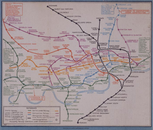
The direct action we can take from this in relation to data visualisation is that we should always design our data visualisations with the task that someone is trying to achieve at the very front of lour minds. Because of selective attention the way that people perceive a visualization will be driven by the task that they are trying to achieve and we can use this to our advantage. The map below provides a lovely example of this – take a minute to look at it, do you know what it is?
The was the official London Underground map from about 1930. the London Underground company, however, were having a real problem as people couldn’t find their way around the underground system because the map was too complicated. so they issued a challenge to people to come up with a better map. One of the people who took up this challenge was Harry Beck, an electrical draughtsman at the London Underground company. He famously observed that:
“If you’re going underground, why do you need bother about geography? … Connections are the thing”
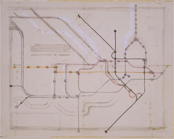
The image below is one of Beck’s early sketches for the new map he devised, from which his background as an electrical draughtsman is pretty evident. Beck realised that the task people were trying to achieve when they looked at this map (or data visualisation) was to find the connections from one place to another and so everything that didn’t contribute to this would just distract and so should be removed.
Source: Victoria & Albert Museum
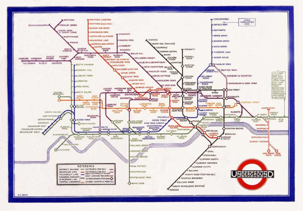
The map below is the 1933 London Underground map based on Beck’s design. This map set the template for transport maps fro years to follow and solved the problems at the London Underground. the lesson we should remember is to always put the task that people are trying to achieve (or the question they are trying to answer) when they look at a visualization at the very centre of our design and try to remove anything that distracts from this.
Source: Victoria & Albert Museum
Also, don’t forget to tune into the 2016 RI Christmas Lectures: Supercharged: Fuelling the future with Saiful Islam. You never know where good inspiration for data analytics might come from!
Source: Victoria & Albert Museum

