
About Our Courses
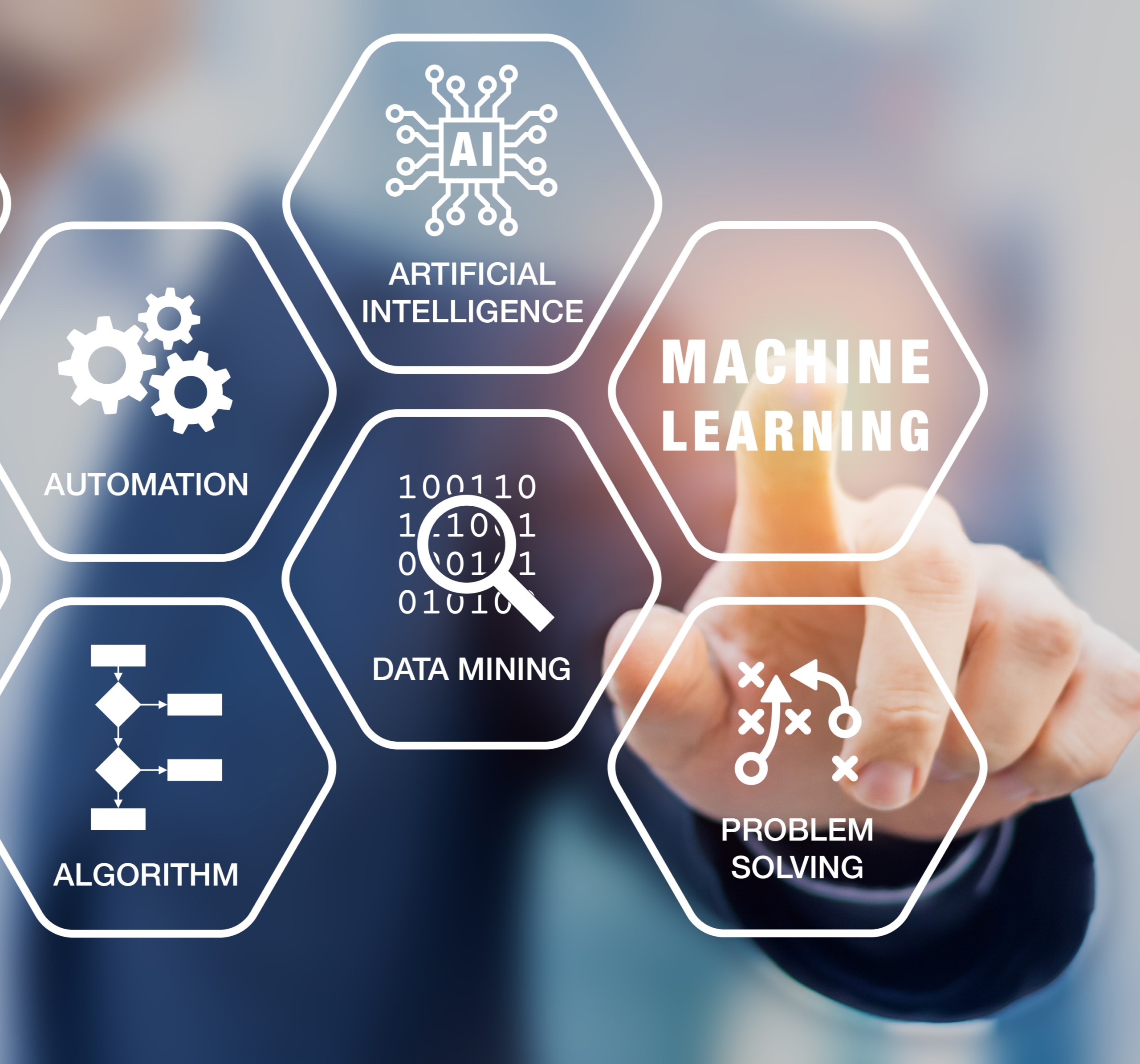
At Krisolis we offer a wide range of courses covering all aspects of Data Science, Machine Learning and Artificial Intelligence. Whether you are starting your learning journey or continuing we have a course offering for you and your team.
Data Science is a large and expanding space but each of our training, courses and programmes considers three core elements: Theory, Tools and Applications. The three core elements are a blended in a way that means learnings can be confidently applied once back in the workplace, and easily transferred as technologies change.
Each of our courses is designed to work as a standalone piece of
learning or can be combined with multiple courses, facilitated
workshops, mentoring and coaching and other beyond-the-classroom initiatives to ensure engaging and rewarding learning paths.
Here is a selection of the expertly designed courses we deliver, which are broken into Fundamentals, Advanced and Adoption.
-

Fundamentals
-

Advanced
-

Adoption

Everyone knows that data driven decisions can be the key to an organisation’s success, but it can be hard to know where to start. Our Fundamentals courses demonstrate how you can put this generation’s most powerful business tools to work for you. Your teams data journey starts here with one of our courses from the following topics:
- Effective Data Visualisation
- Business Analytics
- Introduction to Programming
- Data Tools and their Applications
- Data Preparation and Pre-Processing
- We can customise these courses to suit the tools and technologies you use such as: Python, R, SAS, SQL, Tableau, PowerBI
If your team has established data skills, the challenge can be to keep innovating and progressing. Our Advanced courses are designed to help you and your team evolve your existing data, machine learning and artificial intelligence skills using the most up to date and advanced tools available. Continue your teams data journey with one of our courses from the following topics:
- Deep Learning
- Machine Learning
- Generative AI
- Big Data
- Time Series Analysis
- Natural Language Processing
- Network Analytics
- Anomaly Detection
- Reinforcement Learning
- We can customise these courses to suit the tools and technologies you use such as: Python, R, SAS
One of the central principles of our training programmes is ensuring that skills and knowledge learned with us are applied effectively within your business. To ensure this we offer a variety of courses for business leaders, programme managers and decision makers that ensure that data solutions created by more technical teams can be easily adopted across the organisation. Our Adoption courses cover the following topics:
- Artificial Intelligence (AI) and its applications
- How to get the best from your data
- How to embed effective work practices to allow your team to work well together
- Project Mentoring
- Lunch and Learns