2016 Budget Infographics
Probably second only to elections, the budget is always a great time for dataviz nerds to hoover up charts, graphs, and infographics from the newspapers. At The Analytics Store we were a little disappointed at the number of charts present in yesterday’s papers but still had a nice time looking through the different ways people chose to present data about the budget.
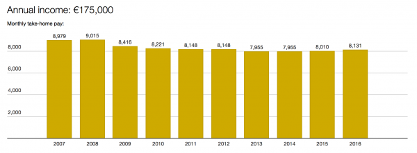
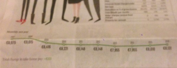
The Irish Times Budget Families piece http://www.irishtimes.com/business/budget-2016/budget-families piece used very simple bar charts to show the projected change in take home pay for a range of different household types. We think that the very simple charts coupled with the persona-based family images did a nice job of conveying some very simple information. One interesting thing to note was that in the online version bar charts were used, whereas in the print version line charts were used (see image below). Line charts are usually more effective at giving a sense of something changing through time, and have the advantage in the print version of taking up less space than bar charts.
We spent a good bit of time looking at the budget infographic produced by the Independent (which is pretty much the same in the print and online versions) http://www.independent.ie/business/budget/news/workers-to-gain-equivalent-of-extra-weeks-wages-as-axe-falls-on-the-usc-31608561.html We’ve reproduced the image below in case the link doesn’t work. The main purpose of this infographics is to compare the gap between spending and income and to show how both spending and income break down into different categories. While the stacked bar chart created a fairly arresting graphic across the centre spread of the paper, it didn’t do such a good job of allowing actual comparisons of the income/spending gap or the main contributors to income and spending.
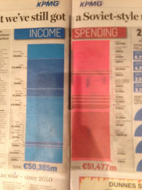
We had a little spare time so played around with recreating this graphic. Essentially this chart is trying to communicate three things: (1) the gap in income and spending, (2) the sizes of the different contributions to income, and (3) the sizes of the different contributors to spending. We have split these three into three separate bar ordered charts. The first shows the difference between income and spending. This difference was slightly lost in the original graphic, mainly because the difference is so small. A small simple bar chart shows it quite effectively.
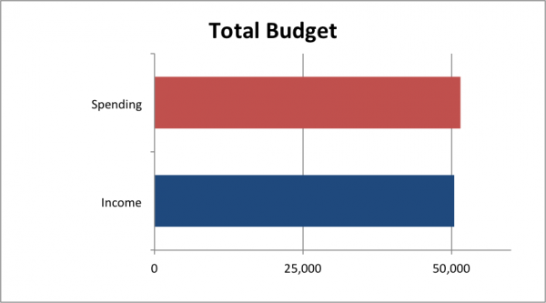
For comparing the different contributors to spending and income we have also used simple horizontal ordered bar charts. Using horizontal bars makes it easy to include the slightly long and awkward category names, and ordering the bars by size makes it very easy to pick out the big and small contributors to both income and spending. We have also represented percentages rather than actual amounts in these charts. While this doesn’t change the shape or ordering of bars in the chart, we feel that it is more useful for people to read percentages than raw amounts so that they can ass the relative contributions of the different categories to income and spending.
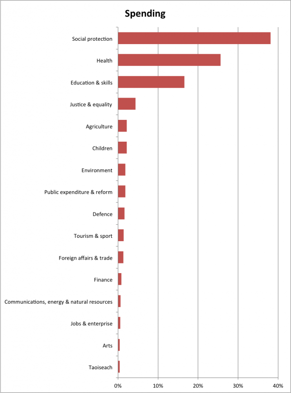
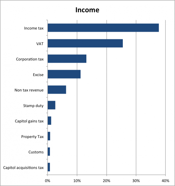
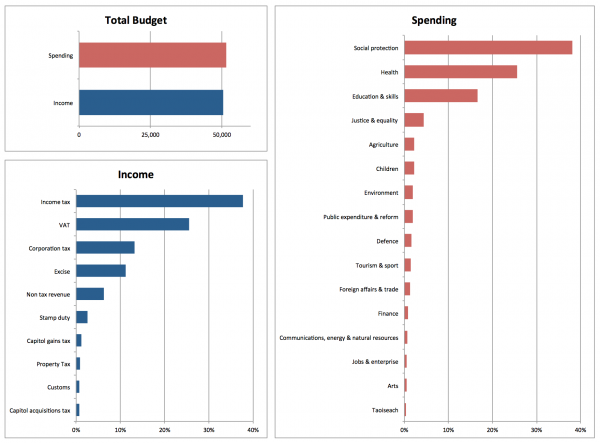
We think this combination of charts does a better job of allowing people to compare income to spending and to compare the different contributors to each. It should also be possible to assemble these charts into a nice block, which is always a very important consideration for newspaper and magazine publishers and something that we sometimes ignore when talking about the best way to design charts. We’ve given an example below.
It would also be useful to include data tables to support these charts, so that exact numbers could be read. Something like the following would be nice (we were a little lazy, hence these are screenshots!).
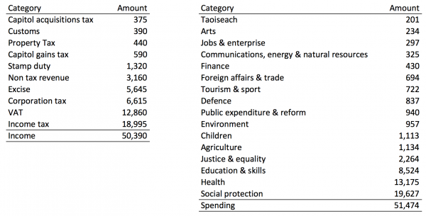
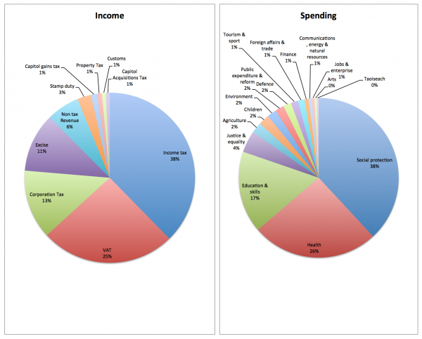
We made these charts simply in Excel (note our totals didn’t quite add up to the same as those in the original, but assume this is just down to rounding errors) and our efforts are in this file Budget2015Visualisations.xlsx This also includes a few other options. We don’t mean to knock the version from the Independent, just to explore other ways the data could have been shown. The most important thing is not to try to show this data in pie charts like the following!
